This year, VisAbility embarked on an exciting journey of discovery. We spoke to the people who matter most: our clients, their families and carers, our staff, volunteers and the broader community.
We asked ‘What does VisAbility mean to you?’ And, we listened.
Of all the fantastic input, there was one clear, resounding response. It was consistent with everything VisAbility does – from the services we deliver, to the people we support, to the staff we employ, and the facilities we deliver services from.
VisAbility is for people with low or no vision.

That’s why, from today, you may notice something different about VisAbility.
- Our new brand leads the way in accessibility
- Our new voice speaks to people with low or no vision, their families and carers
- Our new direction proudly says, “We’re here for people who are blind or vision impaired.”
And, while we’ve changed a bit, our comprehensive and inclusive services remain the same. From children and youth services and adult therapies, right through to assistive technology, audio book library services, employment, accessibility training for businesses and Guide Dogs.
Our purpose is to support and inspire people living with blindness or vision impairment to live the life they want, with confidence.
Our promise is to listen to you. To understand your vision of the life you want to live. And to give you the practical, emotional and peer support you need to do the things you love to do.
Our new VisAbility logo
The new logo is a bold and simple wordmark with the highest level of contrast (black on white, or white on black) for maximum accessibility for people with low or no vision. The font is sans-serif and the V, A and b are all rounded in shape. There is also a version of the logo that incorporates Braille dots below the wordmark.
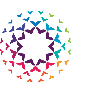
Our new VisAbility symbol
The new symbol is a bright and bold circular graphic made up of concentric V shapes. There are twelve colours ranging from fuchsia and maroon, through to apple green and teal, through to aubergine and purple.
Questions
Why has VisAbility changed its brand?
There are two main reasons we have changed our brand:
- To become more relevant for people with low or no vision
- To become more accessible.
When will the new brand be released?
Our website is live and we encourage you to take a look around. Other items will follow in a staged approach, to ensure we are being sustainable, both financially and environmentally.
If I am a client of VisAbility, what will this change mean for me?
There will be no change to the way VisAbility provides its services to you and our community. You may notice a change in the way our marketing materials look, or the way our communications are written.
Your feedback
We value your feedback and want to hear what you think about our new direction. If you have feedback, questions or comments please contact us us.